Interior design trends are constantly evolving, but warm neutral color palettes are proving they have serious staying power. Homeowners, homebuyers, and interior designers are moving away from stark gray tones and embracing softer, warmer shades that create inviting and comfortable living spaces.
From modern farmhouse interiors to luxury new construction homes, warm neutrals are becoming one of the most popular design trends in today’s real estate market. The updated look goes far beyond traditional beige by incorporating layered textures, earthy materials, and sophisticated natural tones that make a home feel both stylish and timeless.
If you’re thinking about updating your home’s interior, warm neutrals can completely transform a space without overwhelming it with bold colors.
Why Warm Neutrals Are Trending Again
Today’s buyers are searching for homes that feel welcoming, relaxing, and move-in ready. Warm neutral interiors photograph beautifully online, appeal to a wide range of buyers, and help create the calm, comfortable atmosphere many homeowners want.
Unlike the flat beige interiors popular years ago, modern warm neutrals combine multiple shades and textures to create depth and character throughout the home.
Popular warm neutral tones include:
Creamy whites
Soft taupe
Sand and oatmeal colors
Warm greige
Caramel and mocha tones
Muted terracotta
Soft clay colors
These shades work especially well in living rooms, kitchens, primary bedrooms, and open-concept floor plans commonly found in today’s homes.
Layering Creates a More Luxurious Look
One of the keys to making warm neutrals work is layering complementary tones instead of relying on a single color throughout the room.
Combining light and medium neutral shades creates visual interest while maintaining a clean and cohesive design style. Homeowners can use layered neutrals through:
Area rugs
Accent pillows
Upholstered furniture
Throw blankets
Curtains and drapery
Wall art and décor
Layering helps a space feel cozy and elevated without becoming overly busy or cluttered.
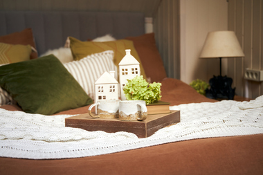
Texture Brings Neutral Spaces to Life
When using a neutral color palette, texture becomes one of the most important design elements. Mixing materials and finishes prevents the room from feeling flat while adding warmth and personality.
Some of the most popular textures in modern interior design include:
Linen fabrics
Chunky knit blankets
Natural woven baskets
Matte pottery and ceramics
Bouclé furniture
Wood grain finishes
Stone countertops and accents
These textures help create the relaxed, upscale aesthetic that many buyers associate with luxury homes and professionally staged properties.
Natural Materials Complement Warm Neutrals
Warm neutral interiors pair beautifully with natural materials commonly found in today’s home design trends. Organic finishes help reinforce the earthy, calming feel homeowners are looking for.
Popular natural elements include:
Light oak wood tones
Walnut furniture
Stone fireplaces
Travertine accents
Leather seating
Indoor plants and greenery
These materials can instantly make a home feel more custom, modern, and connected to nature.
Warm Neutrals Help Homes Feel More Marketable
For homeowners preparing to sell, neutral paint colors remain one of the safest and most effective ways to appeal to buyers. Warm tones help rooms feel larger, brighter, and more inviting during showings and listing photography.
Many real estate professionals recommend warm neutrals because they:
Appeal to a broader audience
Create a move-in ready appearance
Complement multiple decorating styles
Improve online listing presentation
Make spaces feel brighter and more open
Using warm neutral paint colors can be a relatively affordable home improvement project that may help increase buyer interest and overall property appeal.
Add Personality with Accent Colors
Warm neutrals work especially well as a foundation for accent colors and seasonal décor. Once the neutral base is established, homeowners can personalize the space with pops of color through artwork, pillows, furniture, or accessories.
Popular accent colors paired with warm neutrals include:
Sage green
Navy blue
Rust and burnt orange
Olive tones
Charcoal black
Dusty blue
This flexibility allows homeowners to easily refresh a space over time without completely redesigning the room.
Finishing Touches Complete the Look
Small details can make a major impact when designing a warm neutral interior. Lighting and metallic finishes help tie everything together and add an extra layer of sophistication.
Consider incorporating:
Brass fixtures
Bronze hardware
Gold accents
Warm LED lighting
Soft table lamps
Layered lighting throughout the home
These finishing touches help create a comfortable, high-end atmosphere that feels both modern and timeless.
Final Thoughts
Warm neutral interiors continue to dominate modern home design because they strike the perfect balance between style, comfort, and versatility. Whether you’re updating your current home, preparing to sell, or simply looking for fresh interior decorating ideas, warm neutrals offer a timeless design approach that works with nearly every style of home.
As homebuyers continue prioritizing comfort, functionality, and welcoming living spaces, this cozy design trend shows no signs of slowing down.